
From the first day of my blogging, I knew that there was a technical word called ‘SEO.’ But I didn’t know anything about it.
As time passed, I got to know so many things that were essential to grow my blog traffic and search presence.
One integral part of SEO is ‘MOBILE SEO.’ Where I learned some tactics that help me grow my overall traffic including mobile.
Similar to SEO techniques, Mobile SEO techniques are also those that Google cares about. It got confirmed when Google introduced a new update “Mobilegddon”. The primary focus of this algorithm is to give vital importance to the mobile-friendly site.
Before I dive into MOBILE SEO, first I love to show you what and why mobile optimisation is essential.
What is mobile optimisation?
It is a process of making your site responsive, mobile-friendly and provides the best experience to the user. It helps you grow your business that’s why mobile optimisation is essential to a company.
A few years ago, most of the people accessed the internet using the desktop because of less mobile accessibility. But now over half (52%) of the searches are now come from the smartphones. Similarly, According to Google, the number of the smartphone has surpassed the number of desktops which shows that mobile is your primary source to build your online presence.

In fact, according to http://www.comscore.com, smartphone’s users spend 69% of the media time on mobile.
There are hundreds of studies that confirm why it is essential to optimise your site for mobile devices. Some of the popular studies I’m going to share with you.
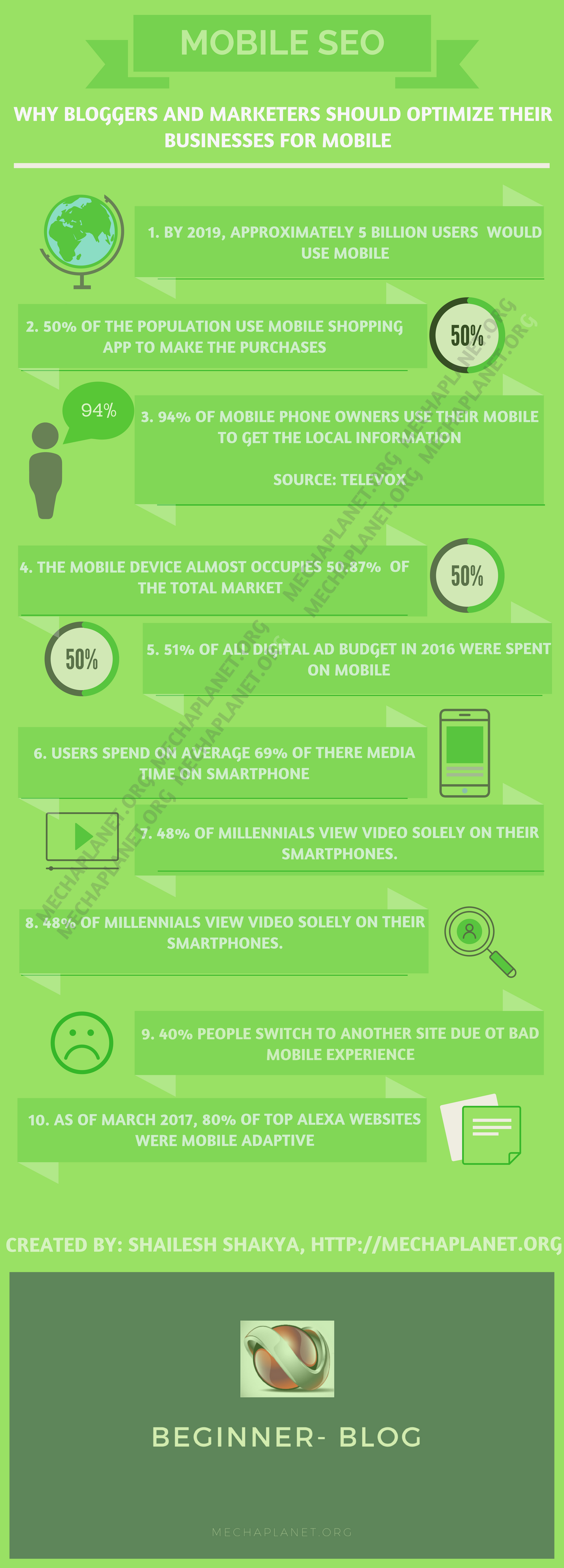
- According to “Statista” prediction, by 2019, 2.71 billion users would use a smartphone.
- 94% of the smartphones users use their phone to get the local information. (Televox)
- Mobile covers 50.87% of the market in the world.
- 80% of the website is now mobile optimised. (Mobiforge)
- There is a 270% increase in the mobile app market, from $70 billion to $189 billion by 2020.
- In February 2016, Google started showing AMP results in SERPs.
So far you have understood the importance of mobile SEO, and you can think about how mobile is revolutionising the marketing and business industries. I don’t think you should leave your site without optimising it for mobile devices.
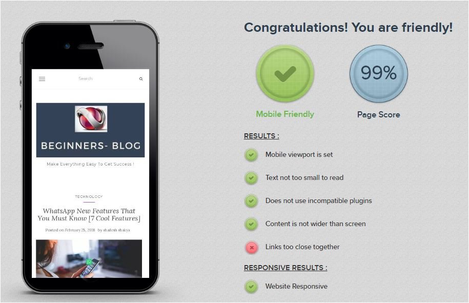
Ok, you know the reason why you need mobile optimization. Let’s move further and understand how do you check if your site is mobile optimised?
Before you start taking the actions, you need to check mobile optimisation to ensure whether your site is mobile friendly.
Thankfully, there are a couple of mobile SEO tools that you could use to do the mobile-friendly test.
A shortlist to run a test: –
- Mobile-friendly test with Google – https://search.google.com/test/mobile-friendly
- SEOcentro
- Testmysite
- SEOsmalltools
- Bing – Mobile Friendliness Test Tool
- Mobile-Friendly Website Test- RankWatch
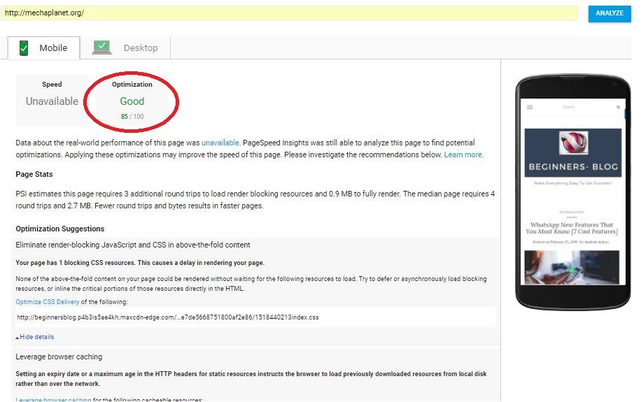
Apart from these tools, you need to check for the loading speed of your site because 40% of the people leave the site due to a bad experience.
You can use the PageSpeed Insights tool. It gives you speed report for both mobiles and the desktop. The cool feature of this tool is, it gives you the optimisation options to suggest you the best way to improve your site loading speed.
For best optimising your site, you need to know the three models to handle the multiple sizes of the viewport.
- Responsive web design: In this configuration, one Url delivers the data to different devices. HTML code goes the same for every device.
- Dynamic serving: One URL deliver the data to different devices, but the HTML source code goes differently for every device.
- Separate URLs: Site URL, as well as HTML source both, are different for different-2 devices.
According to your application, you can switch to any configuration. However, there are pros and cons of every setup, but you select an appropriate design format for your business.
If you’re a blogger, then Responsive web design is best. But for an e-commerce site or business website, it’s mandatory to have a ‘Separate URLs’ configuration for best user experience.
Ok, now you know why it is essential to have a mobile optimised site. Next, it’s time to unleash mobile SEO techniques that would surely help you improve your site presence on mobile.
Mobile SEO best practices/techniques
#1. Never block your CSS, JavaScript and images – You need to ensure that Google only understands your mobile design if you enable all scripting and CSS. A time ago, Google just rendered your text, but now you need to provide a better option to differentiate all design model. So, presenting your CSS and JS in front of Google is the best mobile SEO practice to make mobile-first indexing.
But, how do you know that you have not blocked the resources?
It’s pretty simple, just go ahead and check your Robot.txt file. If you find these lines of code that means Google can see your resources.

Make sure you add these commands to your Robot.txt file to enable CSS, JS and images.
Allow: /*. js
Allow: /*. css
Allow: /wp-includes/js/Allow: /wp-includes/images/
You can use this tool to further check for block resources.
#2. Mobile page loading speed
As I said, about 40% of the people switch to another site due to slow loading and lousy experience.
You should know that how Page load time affects bounce rate
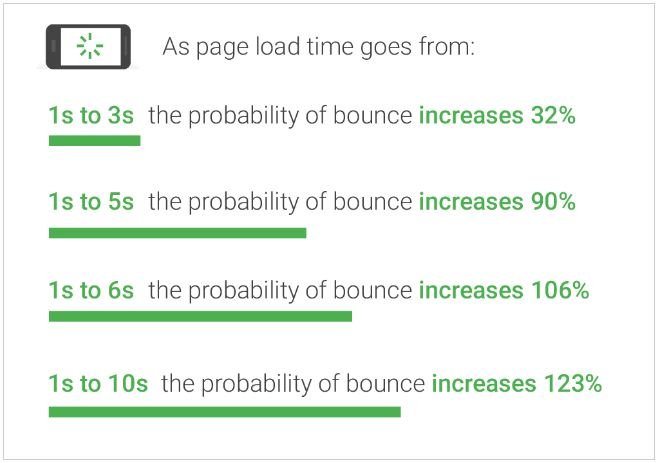
One second delay in loading speed of your site can reduce the conversions up to 7%. In fact, Google has officially confirmed that site loading speed is a ranking signal. So always keep your site loading fast.
These are some of the best SEO practices to optimise your website for both mobile and desktop: –
- Optimize your image for mobile using proper CSS formatting. The best method to optimise the pictures (JPEG, PNG and GIFs) is, open your Adobe Photoshop and go to file > save the images for web and reduce photos to 70%.
- Store a static copy of your site in different-2 geolocations using CDN. (How to configure CDN on WordPress using WP fastest cache plugin)
- Keep your server response time optimization. (should not exceed more than 300ms )
- Minify JS, CSS and HTML by using the best coding practices. You can take this step when you see Minify resource issues while running a mobile-friendly If you want to minify your HTML, then use HTML Minifier. And to minify CSS, use CSSO by GitHub. For js, use uglify JS.
- Use Gzip file compression to save the database memory.
- Don’t include unnecessary meta TAG and meta content. For best SEO optimisation learn all about a meta tag and meta content.
Attention: Best SEO tools to increase traffic
#3. Select the best site design configuration to provide a better experience to the users
The very first thing is to choose the appropriate configuration model to provide a better user experience.
I’ve discussed all design configuration. Now it’s time to select the best configuration option for designing.
I’m going to explain to you every design model thoroughly. By reading this section, you can select the best option to enhance mobile SEO.
Let’s take the first design option – Responsive web design
As I said, in this design, there is only one URL that delivers the content for multiple devices, and HTML source code also remains the same for all devices.

For example, suppose your site uses responsive web design model. In case, when you open your site on multiple devices, you will find the same URL and HTML source on various devices (Mobile, desktop and tablet).
So, from here one thing is clear that you don’t need to remember the multiple domain URLs to access your site on various platforms.
At the same time, it uses the CSS3 media queries which automatically customise your site design and fit any device.
It doesn’t require 301 redirections which merely means that site loading speed is high.
The second design option – Dynamic serving
Similar to Responsive design, it uses one URL for multiple devices. The only difference is that Dynamic serving uses various HTML source for different – 2 devices.
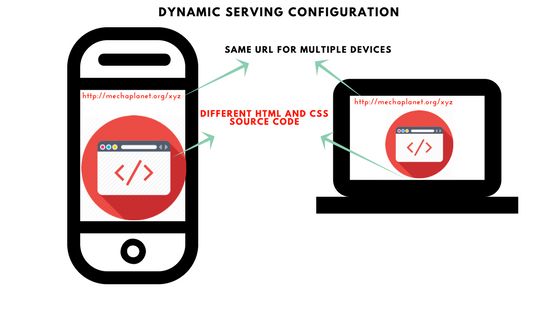
It would be beneficial if you want to give a different experience to mobile users. If you’re going to develop your site on the dynamic serving configuration, then make sure you need to invest more money than responsive design.
Once your site goes live using the dynamic serving setup, the server responds with different HTML source on the same domain name.
But who directed the Google bots to serve the desired design to the end-user. Vary HTTP header holds the whole responsibility.
Now you might be thinking what is “vary HTTP header”?
Vary HTTP header helps Google bots to discover your mobile content faster. It also tells the browser to serve the right content corresponding to the User-agent request.
Without vary HTTP header, the browser may serve you the different HTML source which results in bad user experience.
The last design option – Parallel or separate URL configuration
From the picture given below, you can see the difference. In this option, you can design your mobile version separately on different URL.
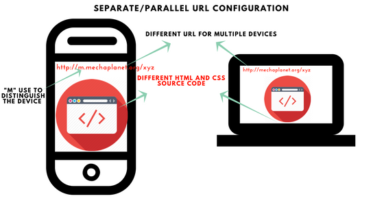
If you’re running a business and want to give a unique experience to the end-user, then you can use this design option to serve your audience better.
To serve you better I’m going to show you the possible pros and cons of using any of these designs
Comparison between Responsive web design V/S Dynamic serving V/S Separate or parallel URL design
| Responsive Web Desing | Dynamic serving design | Parallel URL design | |
| 1 | Cheap, less investment | Costly, high investment | Costly, high investment than Dynamic serving |
| 2 | Simple design | Complex design | Complex design |
| 3 | No 301 URL redirections | No 301 URL redirections | 301 URL redirection is required |
#4. Mobile SEO Audit
A site audit is not a new term for webmasters. In fact, every blogger ran a test to identify the weakness of their sites.
That’s why you should run an audit to understand your site performance. The idea behind this test is to identify the roadblocks that are influencing your site performance on mobile.
There are so many tools that you can use to do the site audit (See the list of tools by scrolling up )
Once you finish your site audit, it’s time for gathering some critical issues and try to fix them.
The common technical SEO problems that you would find while auditing your site: –
- Site loading speed on a mobile device – Make it fix by using CDN, fewer plugins, simple well-coded theme and Responsive web design configuration.
- Image optimisation: Use jpeg image file format, compression and Gzip
- Server response time: Contact your hosting provider to take the possible actions
- Landing page redirections: Redirection increases the HTTP requests which further increases server response time.
- Minify HTML, CSS and JavaScrip: Remove unnecessary commenting from the coding area. (Scroll up to know more)
#5. AMP implementation
AMP (Accelerated mobile pages) is another best mobile SEO practice that includes two benefits, the first it supercharges your loading speed and the second improve your overall SEO ranking score.
For webmasters, AMP is the best source to increase the user experience. But for businesses, don’t use AMP mobile version because it will make the design of your business page very poor.
Disadvantages of using AMP
- AMP Skips your javascript file and disables the client-side scripting that results in the poor user interface.
- AMP has its javascript library
Conclusion
As the mobile crowd is continuously increasing, it’s mandatory to have a website with proper Mobile SEO. If you ignore mobile optimisation, you may lose tons of traffic and harm your business too.
If you are one who has not implemented yet, start doing right away because SEO is the lifeblood of your online business. How you can run a business if you’ve never seen your site on Google for mobile search.
So, make up your mind, look for resources and implement best mobile SEO techniques to increase your mobile traffic.
After reading this guide, now you know how powerful these techniques are and how you can increase your traffic using these best SEO practices.
I hope you would love this article if so then share it on Reddit, Facebook, Twitter, Pinterest and Digg.
If you have any query, then feel free to ask.
An infographic About “10 reasons Why marketers and webmasters should not ignore mobile SEO“
PIN it:


3 thoughts on “Best Mobile SEO Techniques To Improve Mobile Traffic And Rankings”
This article is very well written as it explains in detail the importance of mobile SEO. It is a fact that mobile crowd is continuously increasing and people have easy access to their mobiles than to a laptop or desktop. Mobile optimisation and implementation of mobile SEO are powerful business strategies which will increase tons of mobile traffic and give new dimensions to the use of mobiles.
Yes, absolutely
I am Glad that you find this post helpful…