

There is this particular frustration that every designer, creative professional, or even hobbyist knows too well. You have an idea in your head. It is vivid, it has texture and light and a specific mood. But the moment you try to put it on paper, what comes out looks nothing like what you imagined. The sketch is rough. The proportions are off. The lines are shaky.
That frustration is what pushed me to start testing Luma AI seriously. And what began as one quick experiment turned into several days of pushing the tool across completely different workflows.
This is everything I found.
First, What Makes Luma AI Actually Different
Before I get into the use cases, this is worth understanding because it changes how you think about using the tool.
Most AI image models generate first and think never. They pattern-match your words to pixels. Luma AI’s Uni-1 model works differently. It reasons through your instruction before a single pixel is drawn. It decomposes the request, plans the composition, resolves contradictions, and then builds.
Think of it as the difference between a printer and an architect.
When I told it not to move anything from my sketch, it did not move anything. When I specified a single light source, it calculated where every shadow in the scene should fall. Most tools treat your prompt as a suggestion. Uni-1 treats it as a brief.
That is not a small difference. It changes everything about how the outputs feel.
Use-Case 1: Turning a Rough Sketch Into a Photorealistic Image
This was the first thing I tested, and it set the tone for everything that followed.
I had a hand-drawn sketch of an interior living room. A couch shape, a window with sunlight, some vague furniture outlines, a cat, table lamp, a ceiling light. Nothing detailed. Nothing clean.
I uploaded it to Luma AI, and wrote a prompt that described what the sketch was actually trying to communicate. Modern Scandinavian design, natural light from the left, a grey linen sofa, warm wooden flooring, afternoon sunlight. The sketch showed the layout. The prompt filled in everything the sketch could not say.
What came back genuinely surprised me. The rough couch shape had become a textured linen sofa. The vague window was now an architectural window with light streaming through it at the correct angle. The proportions matched my sketch. The furniture stayed where I had placed it.
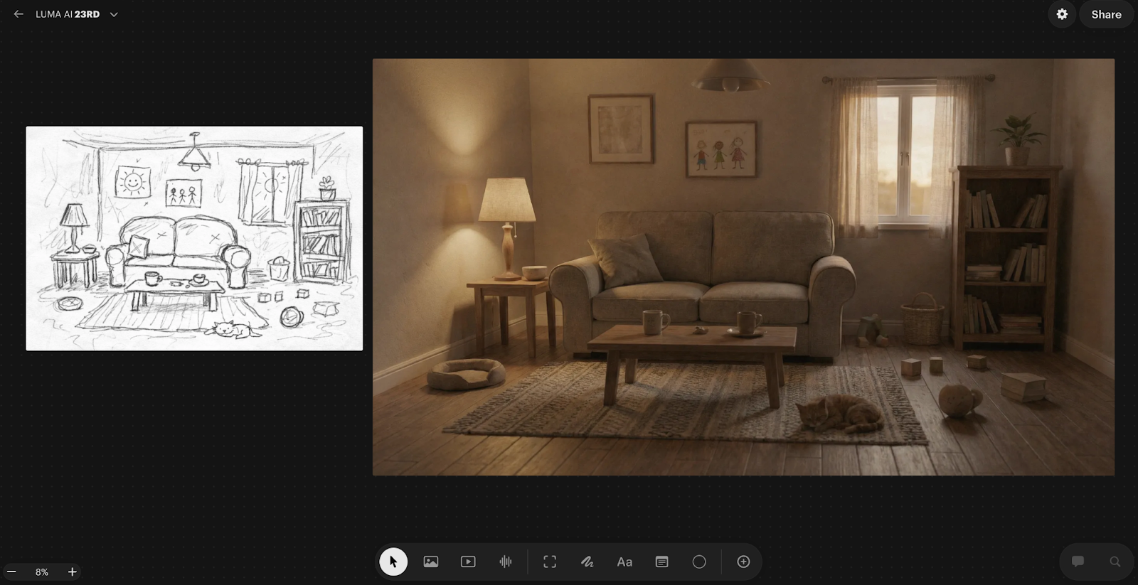
That last part matters more than it sounds. Because Uni-1 reasons through the sketch as a structural brief rather than loose inspiration, the spatial layout is honoured. Most models would have rearranged things in the name of making a better composition. This one respected what I drew.
One practical thing I learned quickly: the quality of your sketch photo matters. A badly lit phone photo gave me noticeably worse results than a clean, flat scan. The AI needs to actually see the lines to honour them.
Refinement is also part of the process, not a sign that something went wrong. My best final output came after two rounds of targeted prompt adjustments. I changed one thing at a time, which gave me real control over the direction rather than rolling the dice with every generation.
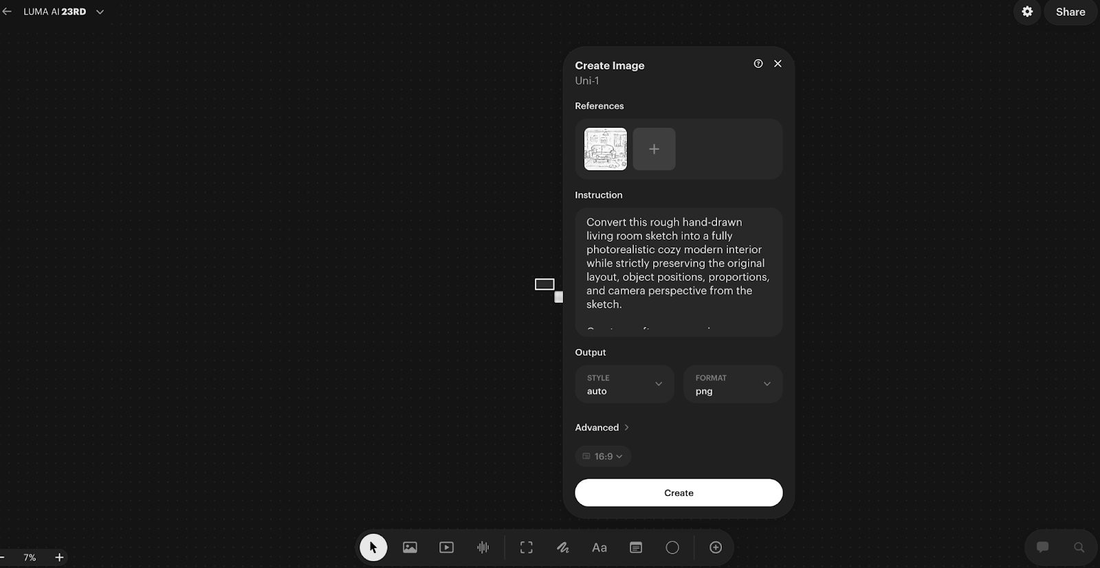
Prompt I used:
“Convert this rough hand-drawn living room sketch into a fully photorealistic cozy modern interior while strictly preserving the original layout, object positions, proportions, and camera perspective from the sketch.
Create a soft warm evening ambience with natural indoor lighting. Replace sketch elements with realistic materials:
– Comfortable fabric two-seat sofa with visible stitching and cushions
– Wooden coffee table with ceramic cups and small decor items
– Textured area rug on wooden floor
– Side table with modern fabric lampshade casting warm light
– Tall bookshelf filled with books and a small indoor plant on top
– Large window with semi-transparent curtains and sunset light coming through
– Minimal wall frames and subtle wall texture
Add realistic depth, shadows, reflections, fabric folds, wood grain detail, and slight lifestyle clutter like toys and a relaxed pet on the floor to maintain natural lived-in feeling.
Use cinematic interior photography style, 35mm lens perspective, shallow depth of field, high dynamic range, soft filmic color grading.
Ultra-real, cozy, emotionally warm residential interior, professional architectural photography quality.”
Use-Case 2: Building a Luxury Room From Scratch Using Multiple References
This one pushed the tool much harder, and honestly produced the result I am most impressed by.
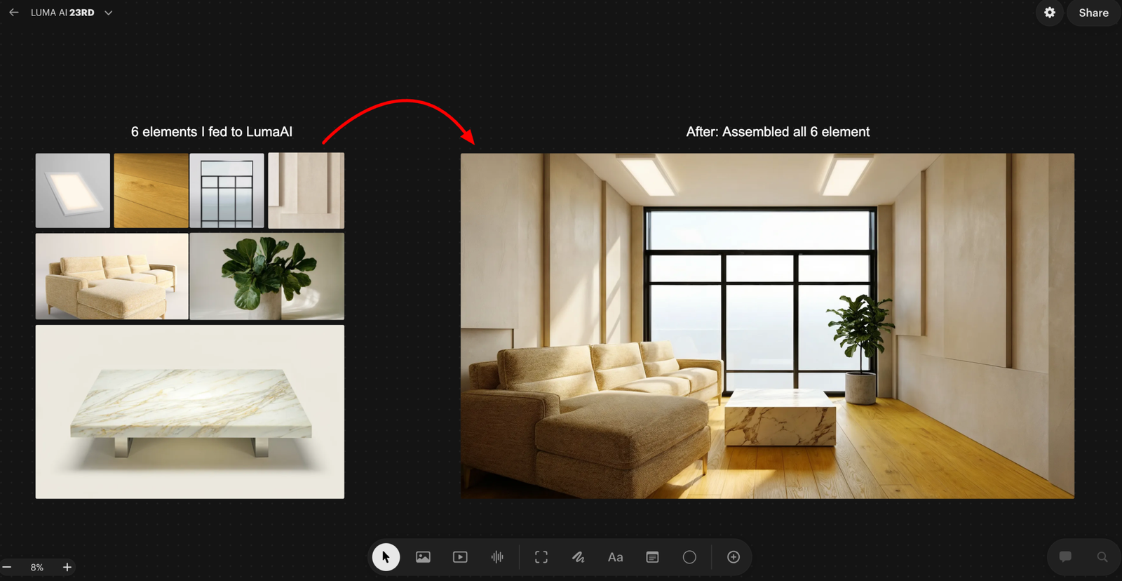
I did not start with a room prompt. I started with raw materials.
I prompted Luma AI to generate eight individual architectural elements in complete isolation. A floor-to-ceiling panoramic glass window. Wide plank warm oak flooring. Micro-cement luxury wall panels. Recessed ceiling lighting. A modular bouclé sectional sofa. An oversized brushed brass floor mirror. A Calacatta marble coffee table. A sculptural fiddle leaf fig in a concrete planter.
Each prompt was written with precision. Lens specs. Material physics. Light behaviour. Surface finish. The outputs looked like catalogue photographs from a luxury architecture studio.
Then I uploaded all eight elements to Luma AI as references and gave it one instruction.
Assemble these into a luxury living room. Arrange them as a professional interior designer would. One light source. One shadow direction. No composite feel.
What came back was not a collage of eight images. It was a room that looked like it had been photographed.
The window anchored the back wall. The floor reads as a single continuous surface. The mirror reflected the plant and the window light accurately. Every shadow fell in the same direction. The materials held their individual character while sitting coherently in the same space.
This is where most AI models fall apart completely. Merging multiple references without creating a visual disaster requires understanding space, proportion, light direction, and material coherence simultaneously. Uni-1 handled all of it.
One honest caveat: when I pushed beyond six reference images, spatial coherence started drifting slightly. Six seems to be the comfortable ceiling for th is workflow. Beyond that, refine in conversation rather than restarting from scratch. The model builds on what was already working, which saves a significant amount of time.
Prompt I used
“Assemble all uploaded product elements into a single photorealistic luxury living room interior. Arrange them spatially as a professional interior designer would: panoramic window as the rear wall feature, hardwood flooring across the full floor plane, wall panels flanking the window, recessed ceiling lights above, modular sofa facing the coffee table, floor mirror leaning against the left wall, plant positioned in the corner by the window. Unified natural daylight entering from the window, consistent shadow direction across all elements, cohesive luxury residential atmosphere. No artificial composite feel — the result must look like a photograph taken inside a completed luxury apartment.”
Use-Case 3: Product Campaign Sheet
This one has direct practical value for anyone working in product design, marketing, or brand work.
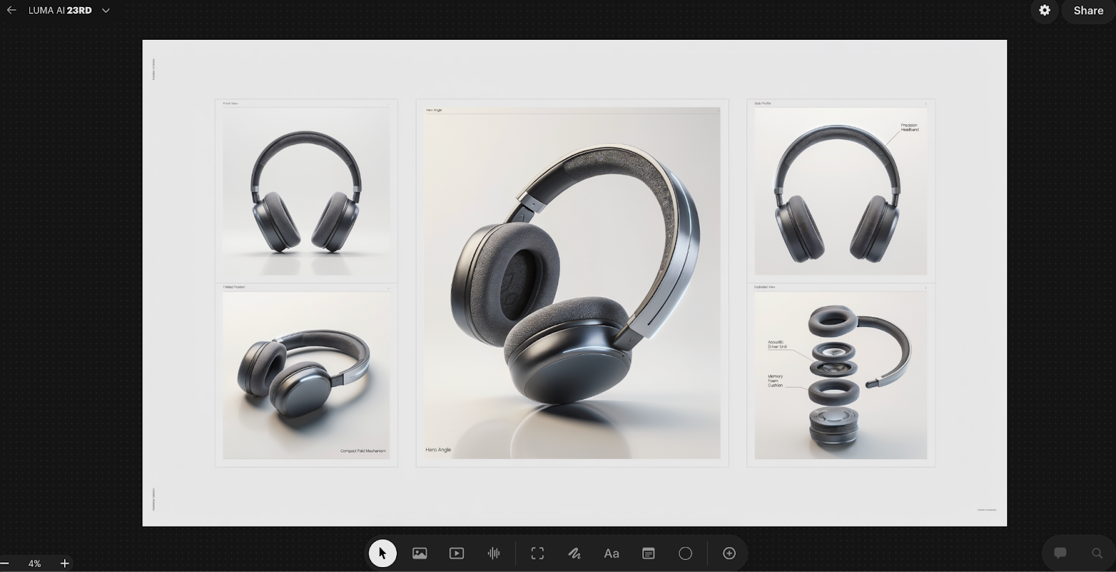
I started with a concept for a pair of over-ear headphones. No 3D model, no existing product photo, just a clear idea of what the product should look and feel like. Matte dark finish, premium build, minimal branding. I wanted to see whether Luma AI could take that concept and build a complete product sheet around it, the kind of structured visual document that a design team or a brand would actually use.
The output came back as five distinct panels arranged in one sheet.
The front view gave a clean, straight-on look at the headphones with proper studio lighting and a neutral background. Exactly what you would need for a spec document or a listing image. The folded position panel showed the compact fold mechanism, which matters for a product like this because portability is part of the value proposition. Just showing the product in one position and calling it done would have missed that entirely.
The hero angle was the centrepiece of the sheet. A large format, dramatic three-quarter view with the product tilted forward and lit in a way that showed the texture of the ear cushion, the curvature of the headband, and the quality of the materials simultaneously. This is the kind of image that leads to a campaign page or a product launch announcement.
The side profile panel went a step further by adding a label directly onto the image, calling out the precision headband. That detail alone changed the nature of the output. It was no longer just a product visualisation. It was a product communication document.
The exploded view was the most technically impressive panel. The headphones were broken apart into their core components, each one separated and floating in space with labels pointing to the acoustic driver unit and the memory foam cushion. This is the kind of diagram you would normally commission from a technical illustrator or build in specialist 3D software.
What I found most useful about this workflow was not just that each individual panel looked good. It was that all five panels looked like they belonged to the same document. The lighting language was consistent. The product proportions held across every view. The overall layout had the kind of clean, structured feel you would expect from a premium brand’s internal design toolkit.
For anyone presenting a new product concept to stakeholders, pitching a design to a client, or building out early marketing assets before a product even exists physically, this kind of output is genuinely production-ready. A single session produced what would previously have required a combination of 3D modelling, studio photography, and technical illustration.
Prompt I USED
“Create a premium product campaign sheet featuring an original futuristic wireless headphone as the hero product. Use a clean structured layout grid on a light neutral studio background suitable for a luxury tech advertisement presentation.
Include one large central hero render in a dramatic three-quarter angle with realistic reflections and soft studio shadows. Surround it with four smaller supporting panels:
• Front View — Design Focus
• Side Profile — Material Finish
• Folded Position — Portability Concept
• Exploded View — Internal Components Layout
Ensure ultra-real material detailing such as brushed metal frame, matte polymer ear cups, breathable fabric cushioning, and subtle LED accent lighting. Maintain consistent lighting direction and realistic perspective across all panels.
Add clean English annotations near each panel such as:
Hero Angle, Precision Headband, Acoustic Driver Unit, Memory Foam Cushion, Compact Fold Mechanism.
Use high-end commercial photography lighting: soft key light, rim highlight, gentle reflection surface, minimal gradient backdrop.
Balanced negative space for branding placement, ultra-sharp focus, shallow depth falloff, cinematic contrast, professional product design presentation quality.”
The Other Use Cases I Tested
Beyond these three, I pushed the tool across several other workflows. Not all of them need a deep breakdown, but the results across each of them reinforced the same core observation.
Infographic generation was impressive in a way I did not expect. I asked it to explain a complex topic as a structured visual diagram. The spatial logic held. Labels were placed correctly. It is not a replacement for a dedicated infographic designer, but as a starting point for something that needs to communicate structure visually, it worked.
The manga character sheet was the one that genuinely shocked me. I asked for front, side, and back views of a character, plus six facial expressions, all in one structured sheet. The proportions stayed consistent across all views. For anyone working in illustration or character design, this kind of consistency across multiple angles in a single output is extremely difficult to achieve and extremely time-consuming to do manually.
The game character turnaround extended that same principle into a production context. Same character across four viewing angles, with costume details matching across all views. This is a real production deliverable, the kind of thing that gets handed off to a 3D modelling team. The fact that it came out of a single workflow rather than being assembled manually is a meaningful time difference.
The cinematic storyboard produced a four-panel scene sequence with consistent character design, coherent lighting across panels, and a sense of progressive camera movement. It looked like a pre-production brief. The kind of thing you would show a director or a client to establish visual language before anything is actually shot.
The temporal sequence test was conceptually interesting. I asked for the same scene across four different time states, early morning, midday, dusk, and night. What I was watching was whether the model understood which elements should change and which should stay the same. The spatial consistency held. The logic of time passing was applied correctly. Shadows moved. Light temperature shifted. The architecture did not.
What This Tool Actually Rewards
Across all of these tests, one thing became consistently clear.
Luma AI does not reward prompting skill. It rewards thinking skill.
The outputs that impressed me most came from sessions where I had done real creative thinking before touching the tool. Where I understood what I wanted, who it was for, what the visual language should feel like, and what the specific constraints were. The tool then executed those decisions with a precision that most AI models cannot match.
When I gave it vague inputs, I got vague outputs. Not bad outputs necessarily, but directionless ones. The model is only as specific as the brief you give it.
That is actually an honest description of what working with a good creative tool feels like. A skilled renderer or a good photographer will also produce directionless work if you do not give them a clear brief. Luma AI behaves the same way, which in a strange way makes it feel more like a professional creative collaborator than most AI tools do.
Where I See This Going in Real Work
The use cases I tested map onto real workflows in architecture, interior design, game development, brand marketing, film pre-production, and illustration. In each of those contexts, there is a phase of work where someone has a clear idea but translating that idea into something visual enough to communicate to others requires either significant skill or significant budget.
Luma AI compresses that phase dramatically. Not by removing the need for creative thinking, but by removing the technical barrier between having an idea and being able to show it.
The gap between a clear idea and a finished visual is almost gone. And for the first time in the AI era, that feels like a tool built for how professionals actually work, rather than for what impresses people in a demo.
Conclusion
That is everything I found across several days of real testing. If you are in design, marketing, architecture, or content work, the multi-reference assembly workflow and the product campaign workflow are the two I would start with. They have the clearest immediate application and the most direct impact on how fast you can move from idea to something you can actually show someone.